How I turned an unbuildable mechanic into 94% first-try comprehension
I owned design end-to-end, from first principles to shipped product, for a real-time variable-prize game with no existing pattern to borrow from. Designing for someone making a real-money decision in seconds, under time pressure, watching a live value that never stops falling.


35%
of launch-day purchases chose the two highest price tiers
94%
understood the full prize progression after one session
92%
correctly identified the stake/prize relationship unprompted.
Validated with 20 participants across three familiarity levels before wider rollout.
Any interface showing a value that changes in real time, a live spend tracker, a trading ticker, a usage meter runs into the same problem this did: people need to see where the number is heading, not just where it sits. The fix travels too: show trajectory, not state.
THE PROBLEM
Users were making a financial decision, under time pressure, with a product they'd never seen.
They had to grasp three things at once - what their stake unlocked, what the prize was right now, and that its value was actively falling. If any link broke, the product broke. No wireframes, no precedent, one fixed brand palette.
EXPLORATION
Three concepts. One test: does a first-time user get it in seconds, without being told?


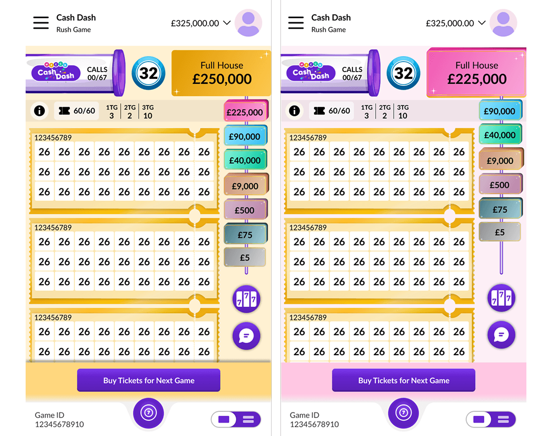
Concept C
Selected
THE DECISIONS
Where I pushed back with evidence, not opinion.
Environment as signal
Engineering wanted a simpler number-only update. I argued a changing number communicates information; a shifting background communicates consequence, users shouldn't have to check the ladder to know the value dropped. We kept it.
Compact ticket format
Users managed up to 60 tickets; the standard template cut how many were visible at once, a functional problem, not an aesthetic one. The compact format also let tier colour carry identity. We shipped it.

scale differs from actual device

scale differs from actual device
THE FINAL DESIGN - RESPONSIVE
Same hierarchy on both platforms; only default visibility changes.
Desktop keeps the full ladder permanently in view. Mobile stacks it one tap away under the floating-button constraint. The decision was made per platform based on available space not stretched from one master layout. At desktop width the environment shift also registers peripherally: users feel the tier drop before they consciously notice it.

VALIDATION
Moderated usability test · 20 participants · including users with zero prior exposure.
We deliberately included genuine novices, not just internal staff - comprehension that only holds for insiders isn't comprehension.
94%
understood the full prize progression after a single session
92%
identified the stake/prize relationship unprompted
100%
completed a full sessions with zero drop offs
IMPACT
A first launch signal, plus principles that outlive this product.
On day one, 35% of purchases landed at the two highest tiers - an early signal (no prior baseline) that the "prize before price" framing reframed the decision from risk to ambition.
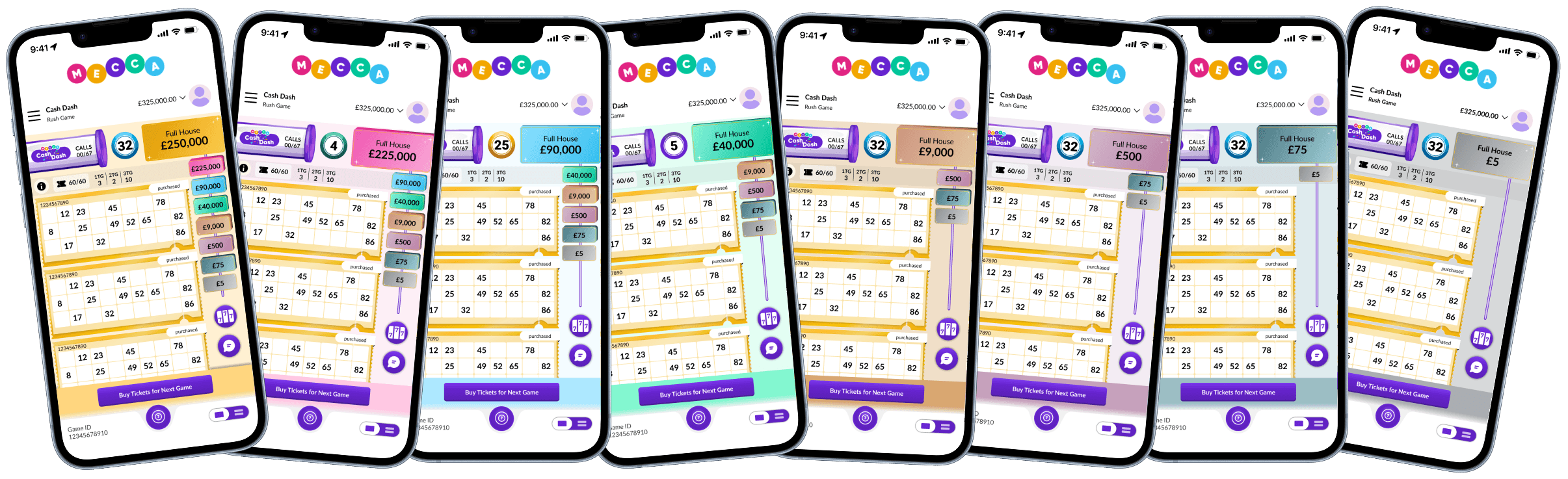
Fixed Mecca brand logo in the header, space we couldn't reclaim from the operator
Three transferable principles came out of it


REFLECTIONS
What I'd change, and what I'd design next.
Both major revision cycles surfaced as engineering constraints at handoff, one shared session in week one would have caught them. Design–Eng alignment is a process problem, not a handoff problem.
Replace the skippable onboarding overlay with contextual prompts woven into the first session, each appearing the moment its mechanic first matters.
Because the mechanic pairs falling value with time pressure, I set a guardrail early: the interface makes the current value and its direction unmissable so a user's choice is always informed, never rushed by hidden information.