How I made a live match catchable in peripheral vision before the user reads a single word
A one-week audit of a live sports-betting card. Designing for a mobile user scanning at speed: time-pressured, thumb moving, deciding between two scrolls.
Client audit - not deployed. Every figure is a countable design fact or a labelled hypothesis, never a claimed business result.
Any high-density real-time surface - a trading blotter, a logistics tracker, a live-ops dashboard has the same problem: the state that matters (live, moving, closing) must register before the user reads. Betting is just the context.
THE PROBLEM
The live cue was invisible at real scroll speed.
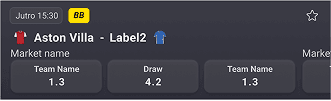
The live match, the reason users opened the app was flagged only by a 3px side border. Add flat odds buttons with no selected state (did the tap register?) and redundant "Market Name" labels eating vertical space.


THE INSIGHT
You can't fix a scanning problem with text the user must stop to read.
Borders and labels need foveal attention the eye has to land and read. But live decisions happen pre-attentively, in peripheral vision. So "live" needed a signal the eye catches without stopping: colour, tint, fixed position. Three channels, because one gets missed.

MARKET AUDIT
The market forces a trade-off. Nobody solves both sides.
A heuristic scan of three major operators showed the same gap: whoever's dense isn't legible-at-speed, and whoever hints at live state gives up density.
SkyBet wins density but its live signal is weak; Bet365 and Betway barely signal live state at all.
The opening: match the densest layout in the market and add the live signal none of them have. That became the design brief.
EXPLORATION
One instinct, tested and killed.
Tried odds buttons right-aligned beside team names (familiar label-left / value-right).
Rejected because: at 390px, names + three 44px targets force truncation; three elements fight for one hierarchy slot; and a vertical eye path (match → score → selection) beat the horizontal zig-zag.

THE DECISION
Density vs. clarity, resolved by counting not opinion.
I replaced text labels which demand focused reading with pre-attentive signals: colour, tint, and position. Live state now registers in peripheral vision instead of on inspection. The layout got denser as a result, but density was the by-product; legibility at scroll speed was the goal.

THE FINAL DESIGN
Key design decisions, annotated.
States: raised odds buttons + blue selected state #1A56DB (7.06:1 / AAA) for instant confirmation
HOW I'D VALIDATE
What I didn't get to test stated plainly.
Nothing shipped, so no claimed outcomes. If it went to build, in order: odds-selection latency in live windows; mis-tap rate on the new buttons; sunlight legibility + a green-tint-vs-slate A/B for fatigue over long sessions.
REFLECTIONS
What I'd do differently, and what comes next
Keep the benchmark descriptive my first pass mixed my own solution into the competitor table, overstating the evidence. And earn the density claim: 5-vs-3 is a real layout fact, but whether it helps or overwhelms is a user question I'd test before calling more-cards better.