Role:

Role:

Lead Product Designer

Lead Product Designer

Scope:

Scope:

2 PM, 1 Engineer, 1 QA

2 PM, 1 Engineer, 1 QA

Timeline:

Timeline:

4 Weeks

4 Weeks

Platform:

Platform:

Mobile + Desktop (Web)

Mobile + Desktop (Web)

Role:

Lead Product Designer

Scope:

2 PM, 1 Engineer, 1 QA

Timeline:

4 Weeks

Platform:

Mobile + Desktop (Web)

How I turned a user drop into a +25 % conversion uplift

Sole owner of every design decision from problem framing to ship. Designing for a mobile user making fast choices in a short session: time-pressured, often distracted, acting on a small screen.

Sole owner of every design decision from problem framing to ship. Designing for a mobile user making fast choices in a short session: time-pressured, often distracted, acting on a small screen.

25+

Conversion Uplift

0

Layout redesigns per brand

12+

Partner brands launched

25+

Conversion Uplift

12+

Partner brands launched

0

Layout redesigns per brand

Validated with AI-predicted attention heatmaps before engineering started.

Any high-density listing surface like financial products, marketplace search, event booking faces the same problem: multiple decision signals competing for attention in a short session. The solution is the same: information hierarchy mapped to scanning behaviour, not visual decoration.

Any high-density listing surface like financial products, marketplace search, event booking faces the same problem: multiple decision signals competing for attention in a short session. The solution is the same: information hierarchy mapped to scanning behaviour, not visual decoration.

Problem:

Approach:

I remapped the layout to match real scanning behavior (F-pattern), then validated the redesign with AI-predicted attention heatmaps before a single line of code was written.

Result:

Conversion rose 25%, and the same component shipped across 12+ partner brands with zero per-brand redesigns.

High-traffic listing surface was converting at just 10% because price, availability, and urgency signals had no visual hierarchy. Users couldn't extract what they needed fast enough to act.

Problem:

Approach:

I remapped the layout to match real scanning behavior (F-pattern), then validated the redesign with AI-predicted attention heatmaps before a single line of code was written.

Conversion rose 25%, and the same component shipped across 12+ partner brands with zero per-brand redesigns.

Result:

High-traffic listing surface was converting at just 10% because price, availability, and urgency signals had no visual hierarchy. Users couldn't extract what they needed fast enough to act.

Problem:

High-traffic listing surface was converting at just 10% because price, availability, and urgency signals had no visual hierarchy. Users couldn't extract what they needed fast enough to act.

Approach:

I remapped the layout to match real scanning behavior (F-pattern), then validated the redesign with AI-predicted attention heatmaps before a single line of code was written.

Result:

Conversion rose 25%, and the same component shipped across 12+ partner brands with zero per-brand redesigns.

THE PROBLEM

The listing surface wasn't failing visually. It was failing informationally.

Conversion rate sat at 10%. The surface had no information hierarchy. Price, availability, and time-sensitive status signals were visually equal, buried, unweighted, unordered. Users couldn't extract what they needed fast enough to act.
Scattered decision signals

No priority hierarchy

Low Conversion Rate 10%

Weather app image

Scattered decision signals

No priority hierarchy

Low Conversion Rate 10%

THE INSIGHT

We were violating a scanning pattern we already knew about.

F-pattern scanning: attention lands heaviest top-left and drops off fast. Our listing cards placed every decision-critical signal price, status, availability centre and right. Exactly where attention dies.

The fix wasn't more information. It was moving the right information to where eyes already land.
P1

Countdown Timer

creates immediate urgency

(Urgency/Cost)

P2

Ticket Price

Captured early in the scan

(Cost)

P3

Reward Pool

Primary Financial Motivator

(Incentive)

P1

Countdown Timer

creates immediate urgency

(Urgency/Cost)

P2

Ticket Price

Captured early in the scan

(Cost)

P3

Reward Pool

Primary Financial Motivator

(Incentive)

EXPLORATION

Three concepts. Each tested a different hypothesis.

Concept A

Vertical card

Rejected

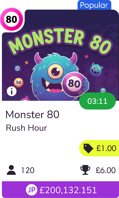
Too much vertical space per item, not enough listings visible above the fold. For a user making a fast decision on mobile, scrolling to compare is a conversion killer. This ruled out the vertical format entirely

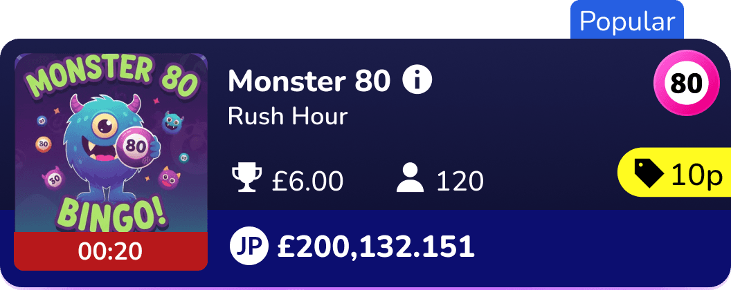
Structurally close to what we shipped, but a PM pushed for an inline purchase button on the tile.

Concept B

Horizontal tile + buy button

Rejected

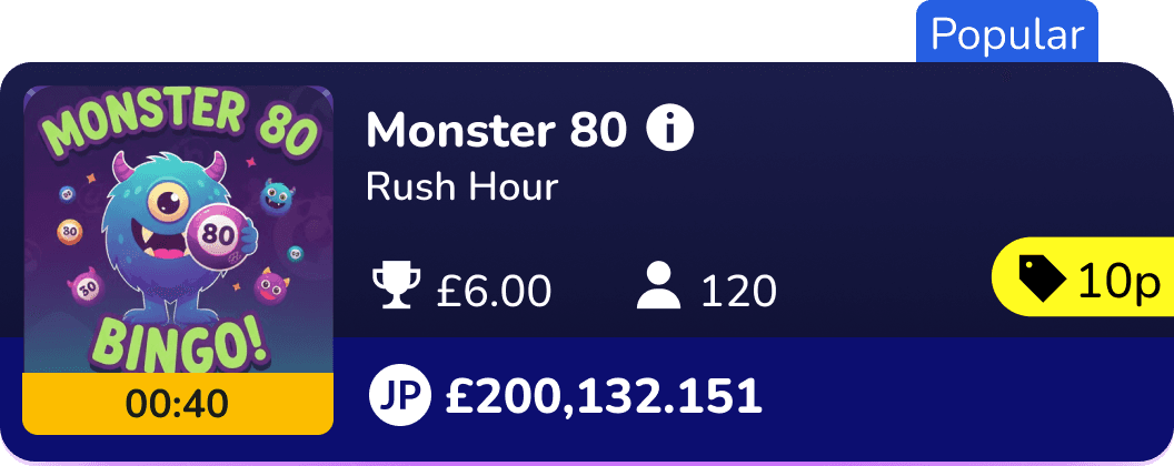
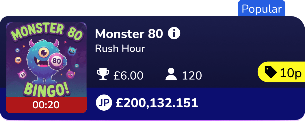
Three rounds of layout iteration to lock the information hierarchy. Decision signals anchored top-left in priority order: countdown timer (urgency), price (cost), reward pool (incentive). Deployable across all partner brands without touching the layout.

Concept C

Horizontal tile + with improved layout

Selected

Concept C

Selected

Horizontal tile + with improved layout

Three rounds of layout iteration to lock the information heirarchy. Decision signals anchored top-left in priority order: countdown timer (urgency), price (cost), reward pool (incentive). Deployable across all partner brands without touching the layout

Concept A

Selected

Rejected

Too much vertical space per item, not enough listings visible above the fold. For a user making a fast decision on mobile, scrolling to compare is a conversion killer. This ruled out the vertical format entirely

Vertical card

Concept B

Horizontal tile + buy button

Selected

Rejected

Structurally close to what we shipped, but a PM pushed for an inline purchase button on the tile.

Concept C

Horizontal tile + with improved layout

Selected

Selected

Three rounds of layout iteration to lock the information hierarchy. Decision signals anchored top-left in priority order: countdown timer (urgency), price (cost), reward pool (incentive). Deployable across all partner brands without touching the layout.

Three rounds of layout iteration to lock the information hierarchy. Decision signals anchored top-left in priority order: countdown timer (urgency), price (cost), reward pool (incentive). Deployable across all partner brands without touching the layout.

THE DECISION

Two pushbacks. Both won with evidence, not opinion.

The timer colour system. Engineering pushed back on a three-state colour shift, a number update is simpler to build than a colour change. I made the case using existing user feedback: people were scrolling past listings about to close without registering the urgency. Green → yellow → red gave the timer a second communication channel beyond the digits. Users didn't need to read "0:12" to know a listing was closing. The colour told them first. We kept it.

Green > Yellow > Red
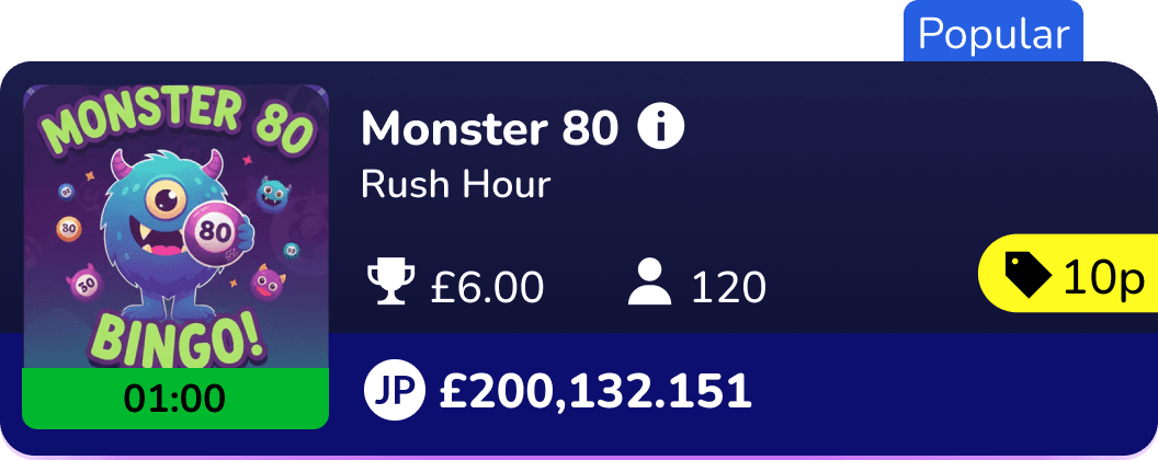
The tile-level purchase button. One PM pushed for an explicit buy button on the card. I pushed back: tapping a listing opens a detail view where the purchase step lives, progressive disclosure that lets users preview before committing. Adding a button to the tile duplicates the step and consumes space the hierarchy needs. We removed it. Validating this with usability testing is the V2 research priority.

See the full accessibility

THE FINAL DESIGN

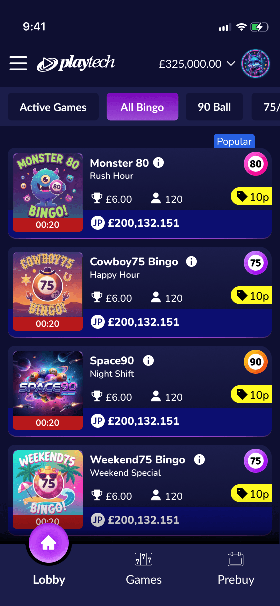
Key design decisions, annotated.
Weather app image
Weather app image

Top-left anchor

countdown timer creates urgency before user reads anything else

Price immediately below

cost captured in the first vertical scan

Reward pool

cost captured in the first vertical scan

Card tap = detail view

no buy button; progressive disclosure reduces commitment anxiety

Top-left anchor

countdown timer creates urgency before user reads anything else

countdown timer creates urgency before user reads anything else

Price immediately below

cost captured in the first vertical scan

cost captured in the first vertical scan

Reward pool

cost captured in the first vertical scan

cost captured in the first vertical scan

Card tap = detail view

Card tap = detail view

no buy button; progressive disclosure reduces commitment anxiety

no buy button; progressive disclosure reduces commitment anxiety

Designed for mobile. Extended to desktop without layout compromise.

Scroll Reveal Image

AI VALIDATION

Validating the hypothesis before a line of code was written.

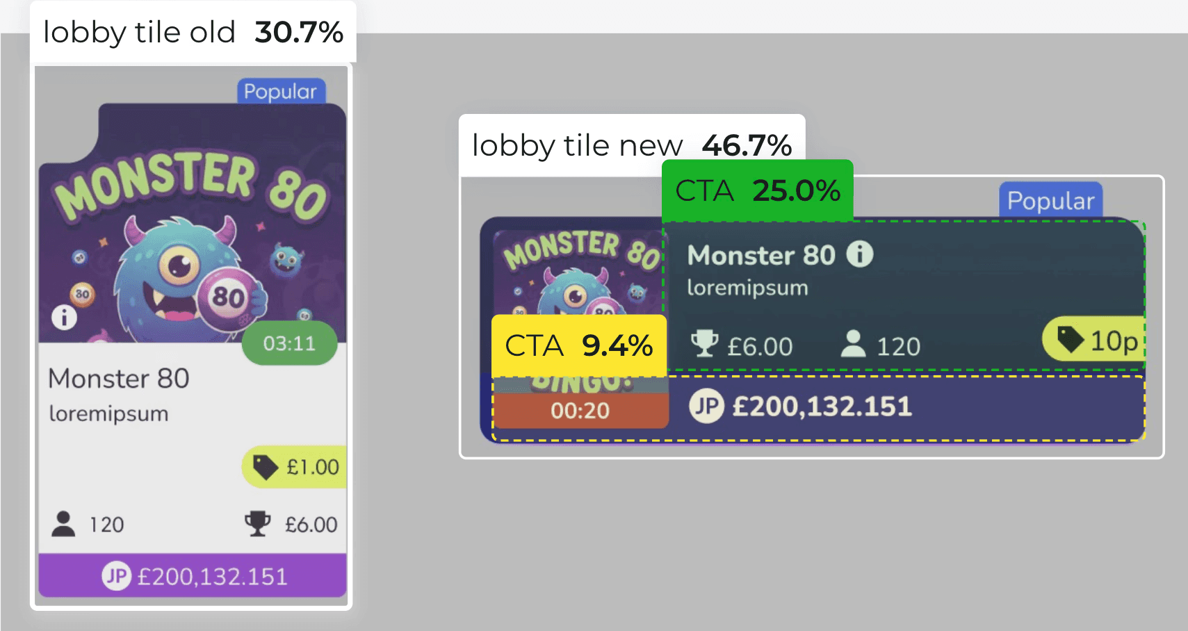
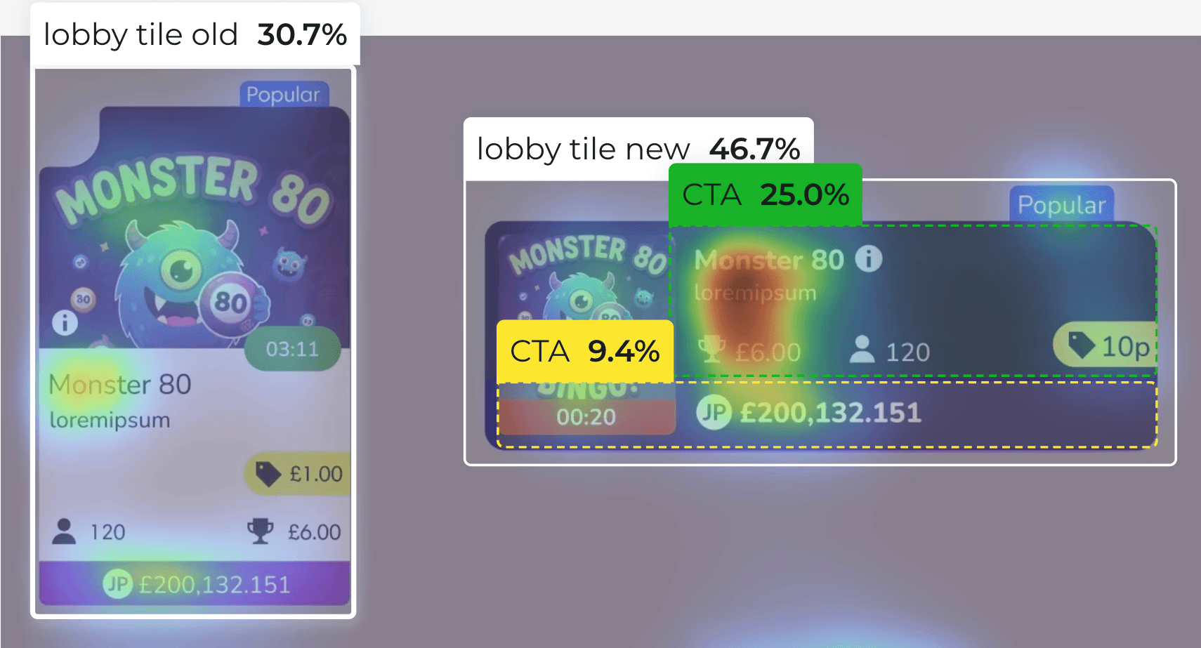
Before engineering began, I used Attention Insight to generate predictive heatmaps of both versions. It was directional check, not a substitute for user research. The prediction held: CTA score 9.4% → 25.0%. Clarity score 30.7% → 46.7%.
CTA Score

9.4% → 25.0%

Clarity Score

30.7% → 46.7%

CTA Score

Clarity Score

30.7% → 46.7%

9.4% → 25.0%

IMPACT

Every key metric moved in the right direction.

+25%

Conversion uplift

12+

Partner brands launched

0

Layout redesigns per brand

Layout redesigns per

brand

The AI-predicted attention shift was confirmed directionally by post-launch analytics. Direction was consistent across all partner brands; magnitude varied by brand context.

Any high-density listing surface, financial products, marketplace search, event booking faces the same problem: multiple decision signals competing for attention in a short session. The solution is the same: information hierarchy mapped to scanning behaviour, not visual decoration.

Built once. Shipped across 12+ partner brands without a single layout change.

Weather app image
Weather app image
Weather app image

A component that doesn't require redesign per brand is a commercial asset

REFLECTIONS

What I'd do differently, and what comes next

Test progressive disclosure earlier. The detail-view decision was grounded in established UX convention, not usability evidence from this specific context. A moderated session pre-launch would have confirmed the assumption or caught an edge case before ship.

Instrument listing states individually. We measured conversion at the surface level. We didn't know which status state - filling fast, full, starting soon was driving or blocking conversion at the card level. That granularity would have made V2 decisions significantly sharper.