DEAL OR NO DEAL · 2024
Role : Lead Product Designer · Team : 1 PM, 2 Engineers, 1 QA · Timeline : 8 weeks · Platform : Mobile + Desktop (Web)
The Brief Said Fix the UI. The Data Said Fix the Mental Model.
The Hook
A high-profile licensed product. Hundreds of thousands of active accounts. A UI that hadn't been touched since the early 2010s.
As the platform moved into its next generation, this was the product the leadership team prioritised first. The brief: fix what was silently failing users without breaking what they already knew.
A 15% bounce rate. A dead-end post-session loop. A core interaction model with no moment of consequence. This is how we rebuilt trust in 8 weeks.
Who We Were Designing For
The fastest-growing segment was 25–34, mobile-first, engaging in short frequent sessions, and comparing every product experience to the best apps on their phone. 60% of users were female. 80% engaged at least once a week. When the UI felt confusing or dated, they left. With no path forward after a session ended, they didn't come back.
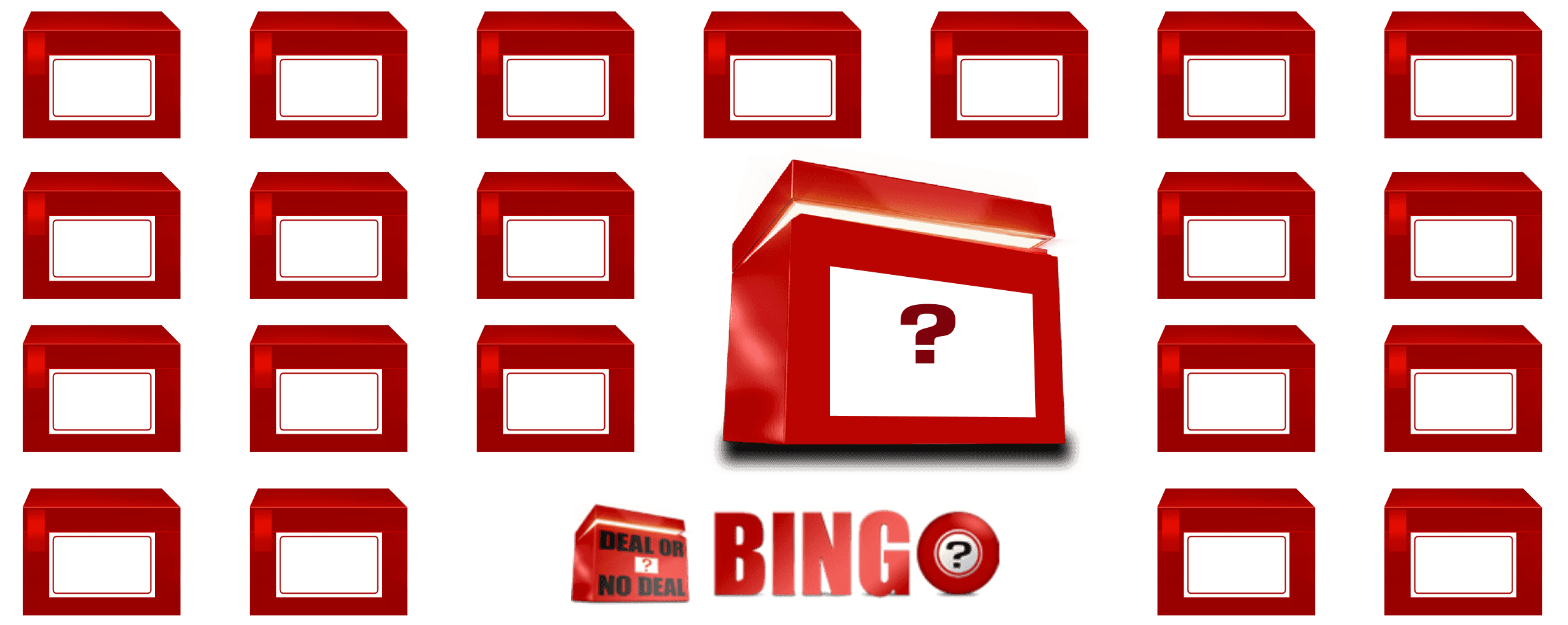
Before


The Problem
Three friction points. All defined by data, not assumption.
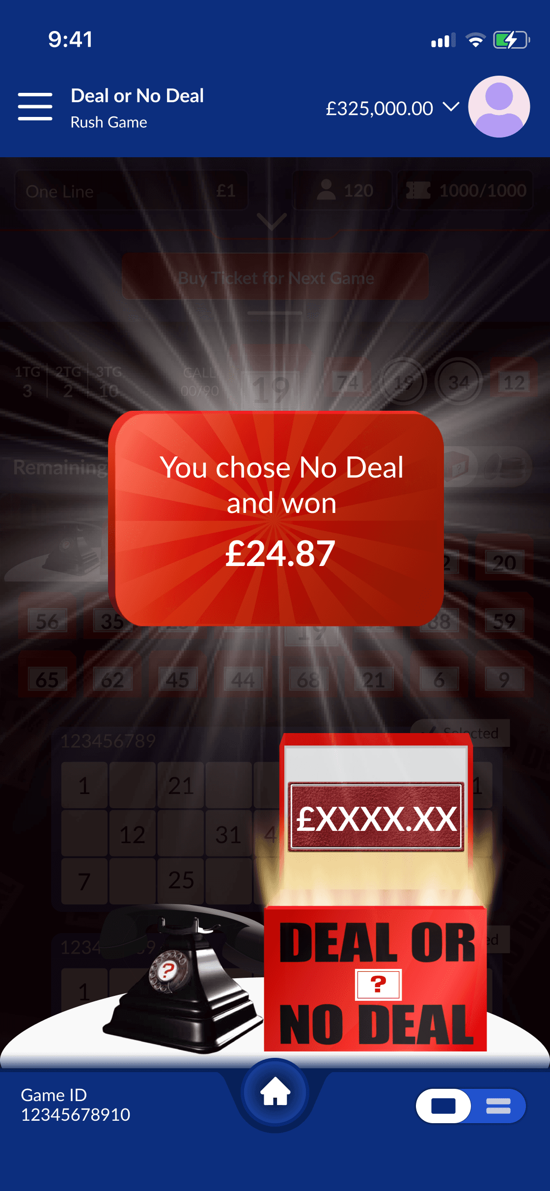
Session replays showed users continuing to interact normally in the seconds after a held prize had been eliminated. They hadn't registered the loss. The UX had no moment of consequence.
Cause-Effect Blindness
01
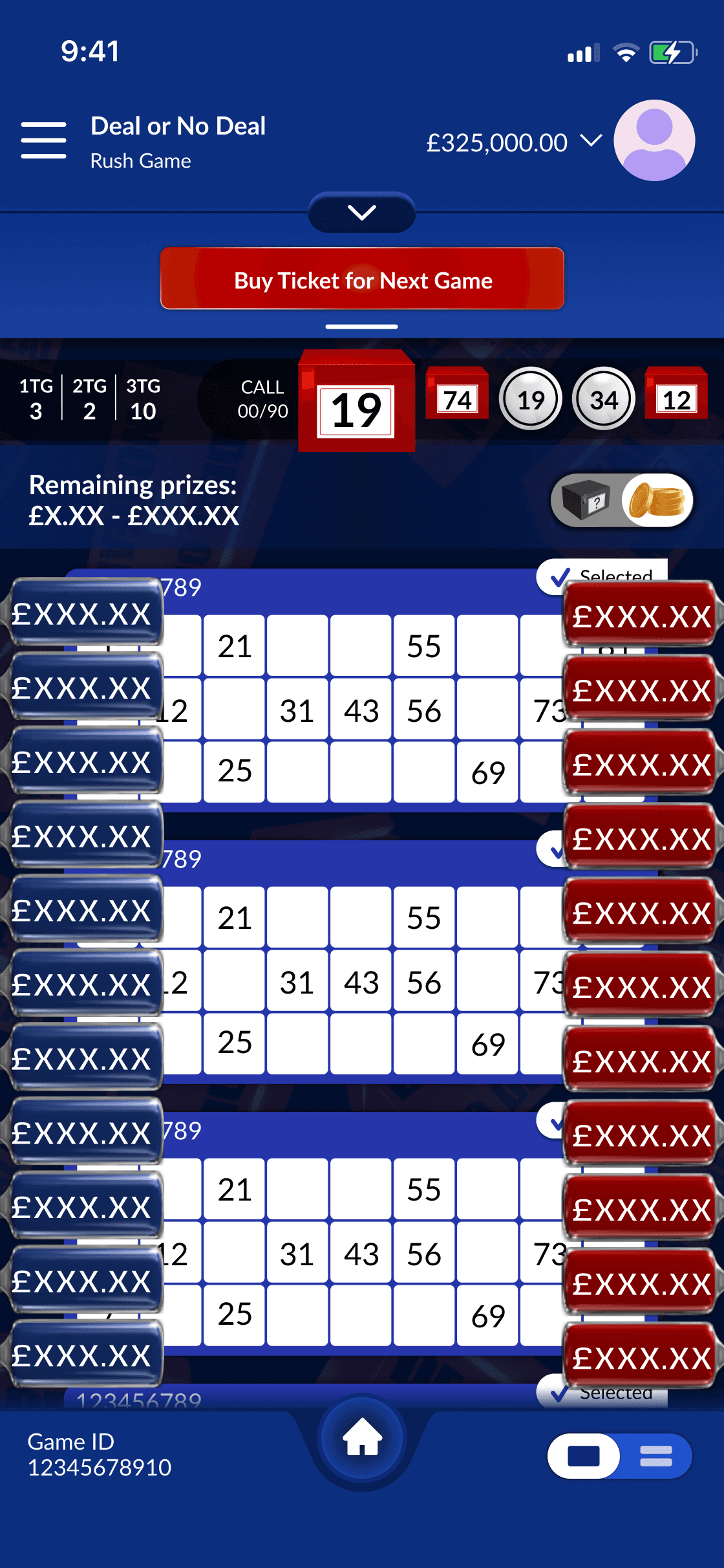
A legacy dev restriction forced a mandatory info panel at the top, consuming nearly 20% of the mobile viewport at all times. User feedback consistently flagged the UI as cluttered. Users couldn't articulate why, but the data showed them scrolling away from the game.
Viewport Constraints
02
Drop-off data showed the sharpest exit point wasn't during session. It was the 8 seconds immediately after a session ended. There was no path forward embedded in the experience. Users simply left.
Re-Entry Friction
03
The challenge wasn't knowing what to solve. It was solving it inside a codebase that pushed back on every decision.
The decision that changed everything
Engineering said the panel was immovable. I brought a prototype to prove otherwise.
A legacy technical restriction forced a persistent info panel at the top of the screen, consuming nearly 20% of the mobile viewport at all times. Engineering declared it immovable.
Rather than accepting it, I built a working prototype of a conditional collapse architecture — the panel would retract during active session time and expand when needed. I brought it to a cross-functional meeting with the PM, Head of Product, and engineering leads. The argument wasn't aesthetic. It was behavioural: users were scrolling away from their content because the panel was eating the screen. Session data backed it. The prototype de-risked it. The team aligned.
The decision didn't stay inside its brief. The collapsible panel was adopted as a platform-wide UX standard across every product in the Next Gen network.
Its adoption across other products in the platform validated the instinct.
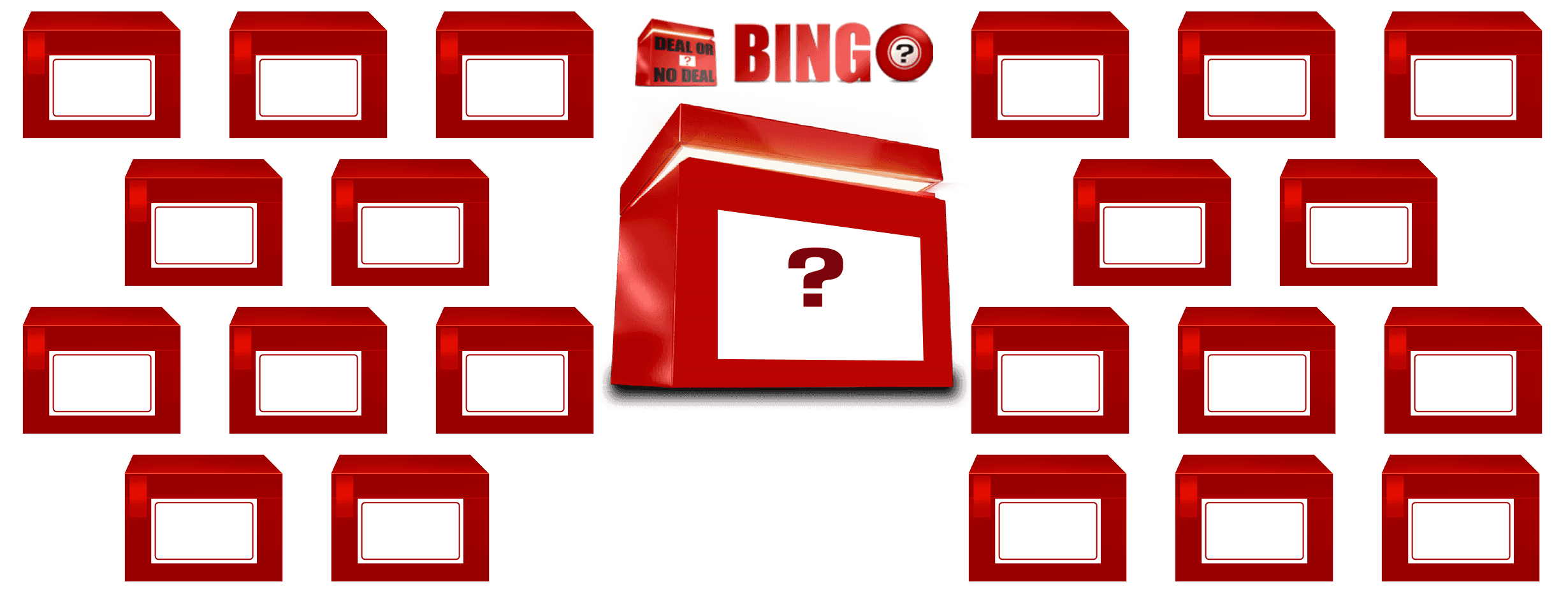
Exploration
Five layouts. Each solved one problem while creating another.
Options 1–4 each addressed one friction point while introducing a new one: buried hierarchy, brand inconsistency, broken conceptual groupings. Option 5 resolved all three simultaneously — the mystery box owned its own row, the prize range and toggle were visually grouped, and the content grid sat cleanly beneath.
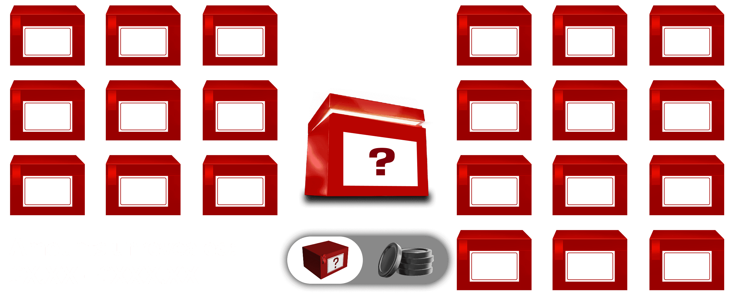
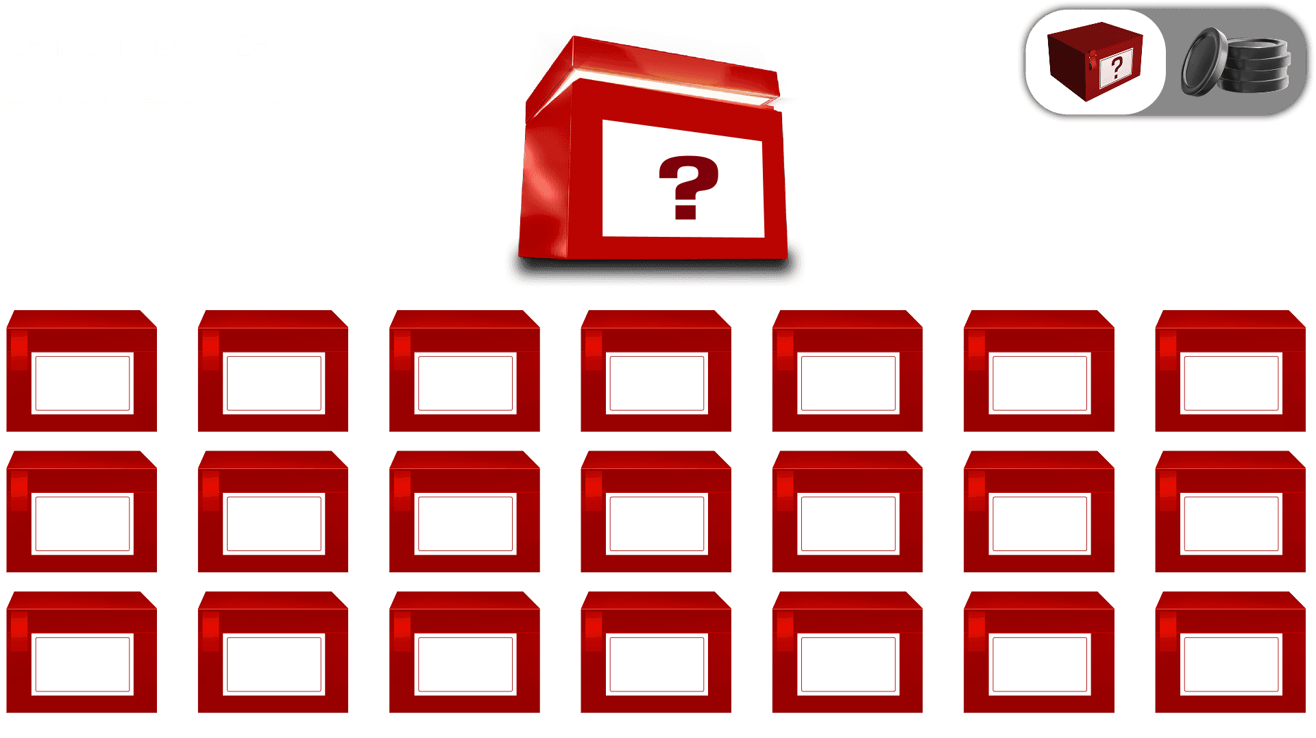
One decision that didn't make the final screens: When the brief called for a branded logo box as the mystery box treatment, I took it to testing before committing. Users couldn't read it as "mystery prize" — they saw IP, not intent. The evidence made the case. The question mark box shipped instead. Data over instinct, every time.

Solution
Three Solutions
Each mapped directly to a friction point. None retrofitted after the fact.

From: one overwhelming view forced on all users regardless of mental model.
To: two modes, each optimised for a different way of thinking about the same information.
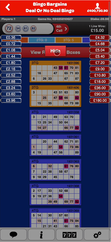
Paddle / Box view switch

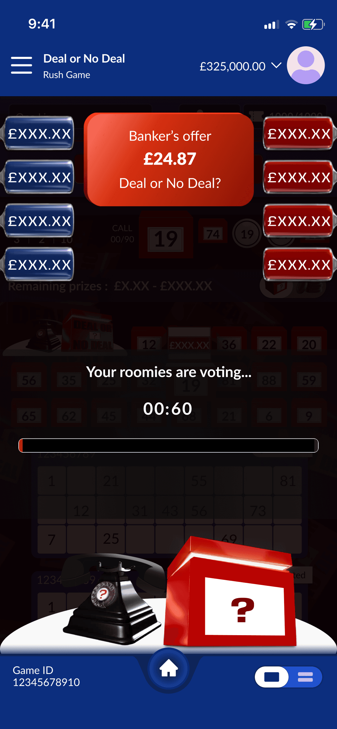
From: session ends, journey stops. No path forward embedded in the experience.
To: the next session is one tap away from inside the current one
Responsive
The Deal or No Deal moment at every screen size.
The highest-stakes interaction in the product — the banker offer and Deal/No Deal decision — needed to work at both mobile and desktop without losing dramatic weight. On mobile, the decision fills the screen, full-width buttons, no competing elements. On desktop, the same interaction sits centred with the session context visible peripherally — users can see their remaining prizes while making the decision, adding stakes rather than removing them.
Same interaction model. Different spatial context. Both deliberate.


Accessibility
Accessibility wasn't in the brief. I introduced it specifically for the highest-stakes screen in the product: the decision moment."
DEAL and NO DEAL needed equal visual weight. No ghost buttons — a secondary-style treatment implies hierarchy where none should exist. Solid fills, white text, defined borders. The distinction is carried by shape, text, and boundary — not colour alone.
The same principle applies to any binary-choice UI — payment confirmation screens, consent flows, destructive action dialogs. Equal-weight actions require equal-weight visual treatment.


Switch between box and paddle view
Metrics
Validated by a 30-participant moderated usability session I designed and led internally, and by post-launch analytics.
Reflections
I couldn't remove the info panel, so I made it interactive. I couldn't use the licensed asset, so I used motion and lighting to create the same emotional presence. What moved the needle was the negotiation, the research leadership, and the ability to see constraints as design material.
When my director pushed for the branded logo box, I disagreed on evidence, not instinct. The question mark box shipped. Users understood it immediately.
What I'd do differently: the mystery box never hit the 1.5× scale originally targeted, and the toggle needed a labelled state from day one rather than a tooltip workaround. Both are known trade-offs I'd resolve earlier next time.
One design decision - the collapsible panel - didn't stay inside its brief. It became the pattern the entire Next Gen platform was built on. That's the standard I hold myself to.
Constraint-led design isn't a compromise position. Any product operating inside a locked codebase, a legacy system, or an immovable technical decision faces the same challenge: you can't always change the structure, so you have to change what the structure communicates. The collapsible panel didn't remove the constraint. It made the constraint work for the user. That principle applies whether the constraint is a regulated data field, a platform API limit, or an inherited component library.