How I turned an "immovable" legacy constraint into a platform-wide standard, and a 33% lift in re-engagement
A high-profile licensed real-money gaming product, hundreds of thousands of active accounts, on a UI untouched since the early 2010s. I led the next-gen redesign: modernising what was silently failing users, without breaking the mental models they relied on.
Every mature product eventually hits this: a locked codebase, a legacy component you can't delete, a field you can't move. The senior skill isn't changing the structure, it's changing what the structure communicates. That transfers directly to any fintech, SaaS, or enterprise surface.
THE PROBLEM
Three friction points, all defined by data, not assumption.
Conversion rate sat at 10%. The surface had no information hierarchy. Price, availability, and time-sensitive status signals were visually equal, buried, unweighted, unordered. Users couldn't extract what they needed fast enough to act.
Cause-effect blindness
replays showed users still interacting seconds after a held prize was eliminated, they hadn't registered the loss. The UX had no moment of consequence.
Viewport constraint
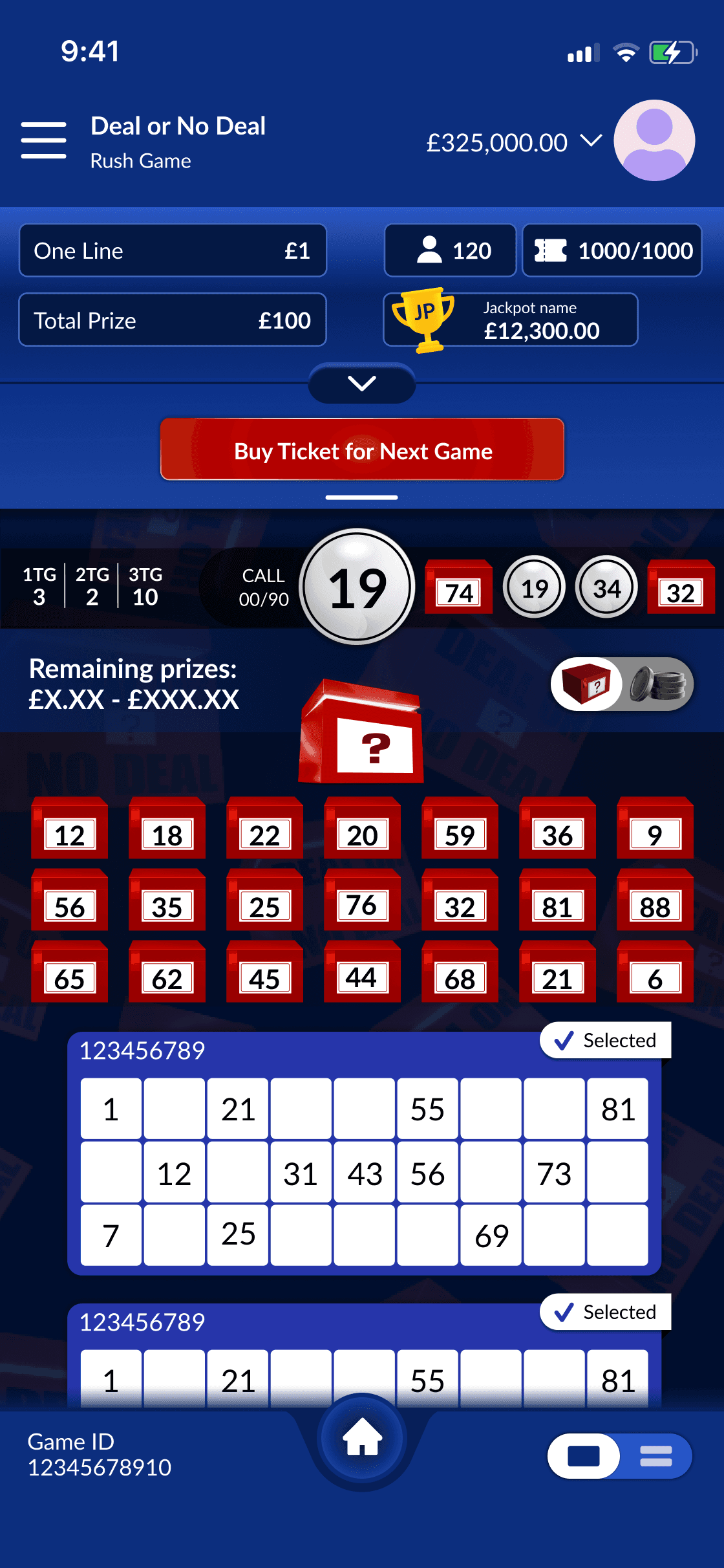
a legacy restriction forced a mandatory info panel consuming 20% of the mobile viewport; users scrolled away from the game.
Re-entry friction
the sharpest exit wasn't in-session, it was the 8 seconds after a session ended, with no path forward.
THE DECISION
Engineering said the panel was immovable. I brought a prototype that proved otherwise
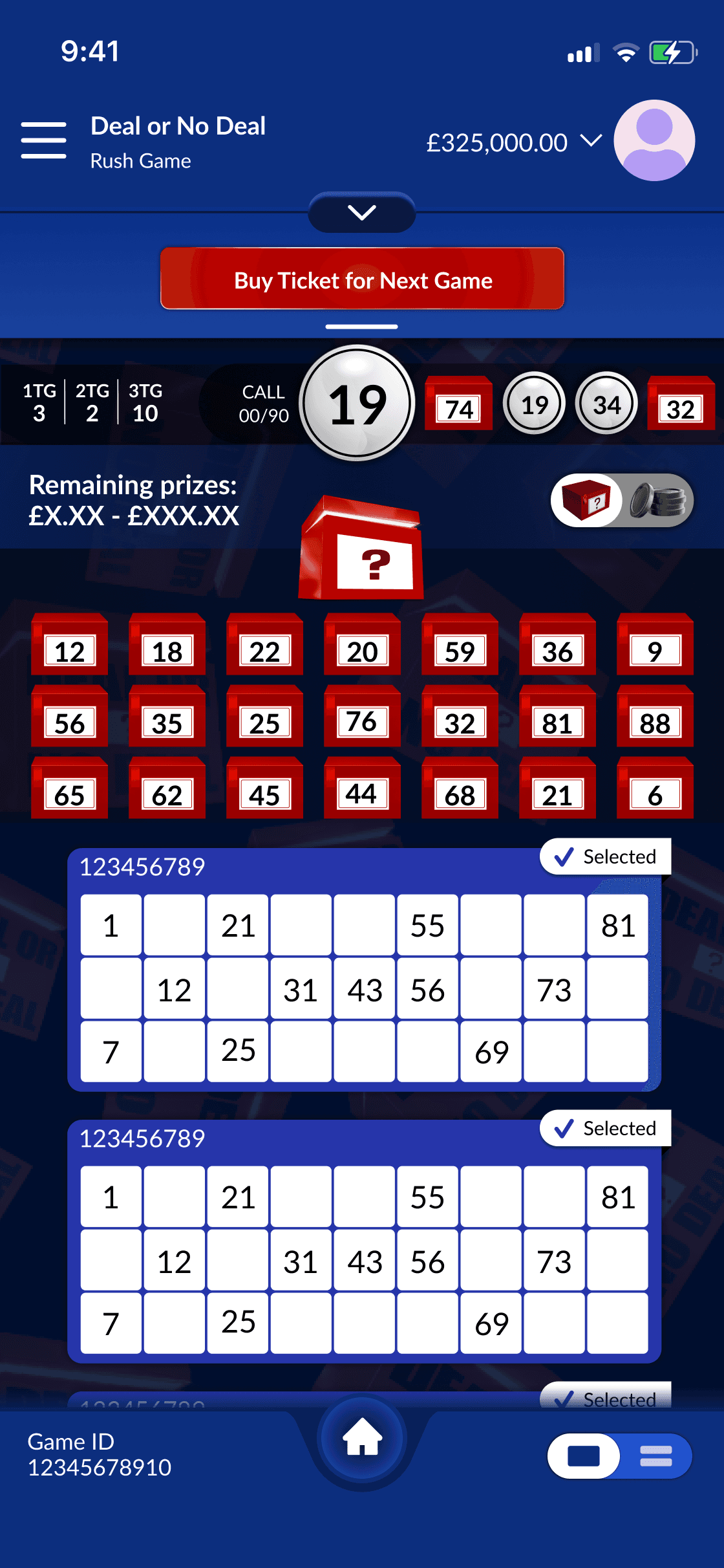
Rather than accept the constraint, I built a working prototype of a conditional-collapse architectur, the panel retracts during active play and expands when needed. I took it to a cross-functional session with the PM, Head of Product, and engineering leads. The argument wasn't aesthetic, it was behavioural: users were scrolling away because the panel ate the screen, session data proved it, and the prototype de-risked it.
The team aligned and the collapsible panel was adopted as a UX standard across every product in the Next-Gen network.

EXPLORATION
Five layouts. Each solved one problem while creating another.

The four rejected
THE SOLUTION
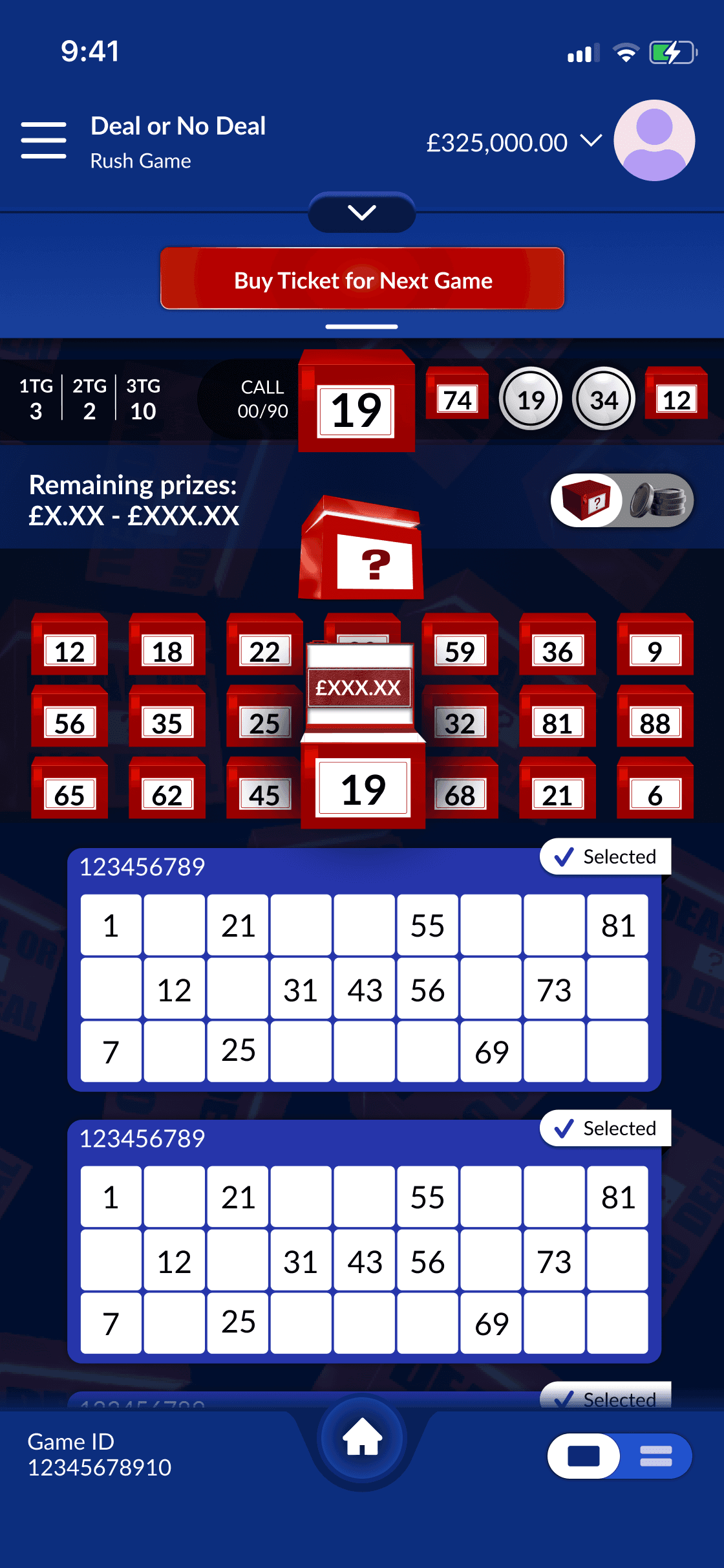
Three interventions, each mapped to one friction point.


RESPONSIVE
The highest-stakes moment, preserved at every screen size.
The banker offer and Deal / No Deal decision fill the screen on mobile (full-width buttons, nothing competing); on desktop the same interaction sits centred with remaining prizes visible peripherally adding stakes rather than removing them. Same model, different spatial context, both deliberate


ACCESSIBILITY
Added where it mattered most: the decision moment.
DEAL and NO DEAL carry equal visual weight, no ghost buttons, since a secondary treatment implies a hierarchy that shouldn't exist. The distinction is carried by shape, text, and boundary, not colour alone. The same principle governs any binary-choice UI: payment confirmations, consent flows, destructive-action dialogs.


See the full accessibility + flow breakdown
IMPACT
One decision outlived its brief.
The collapsible panel became the pattern the entire Next-Gen platform was built on the clearest measure that the work scaled beyond its own screen
+33%
more session continuity
83%
first-try comprehension
5%
Less mid-session drop-off
REFLECTIONS
Constraints as design material.
I couldn't remove the panel, so I made it interactive: I couldn't use the licensed asset, so I used motion and lighting to create the same emotional presence. When my director pushed for a branded logo box, I disagreed on evidence, not instinct, tested it, users saw IP not "mystery prize", and the question mark box shipped.
What I'd do differently: the mystery box never hit it's 1.5x target scale, and the toggle needed a labelled state from day one instead of a tooltip. Whether the constraint is a regulated data field, a platform API limit, or an inherited component library, the move is the same, make the constraint work for the user.