CASH DASH · 2025

Role : Lead Product Designer · Team : 2 PM, 1 Engineer, 1 QA · Timeline : 10 weeks · Platform : Mobile + Desktop (Web)

Cash Dash

There was no existing product to learn from. No UX pattern to borrow. Just a mechanic nobody had designed before — and 10 weeks to ship it.

The product introduced a mechanic no one had shipped before: variable pricing where your choice determines your upside, and the value available decreases in real time with every action taken. Users needed to understand what they were buying, what it was worth right now, and that the value was actively falling — all simultaneously, all without instruction.

I led end-to-end design — from first principles to shipped product — including pushing back on the brief, negotiating technical constraints, and making calls with incomplete information under timeline pressure.

The Challenge

A 0→1 product. No category precedent. 10 weeks.

Users entering a session were making a financial decision under time pressure with a product they'd never encountered. They needed to simultaneously understand what their stake unlocked, what the current prize was, and that the value was actively falling. If any of those connections broke, the product broke.

The brief had three constraints: make the decreasing prize system instantly legible without explanation; work within an existing brand colour palette; make higher price points feel rewarding, not risky. Everything else was blank canvas. No wireframes. No precedent. No existing product to reference.

Design Exploration

Three concepts. One test: does a first-time user understand the value mechanic in seconds, without being told?
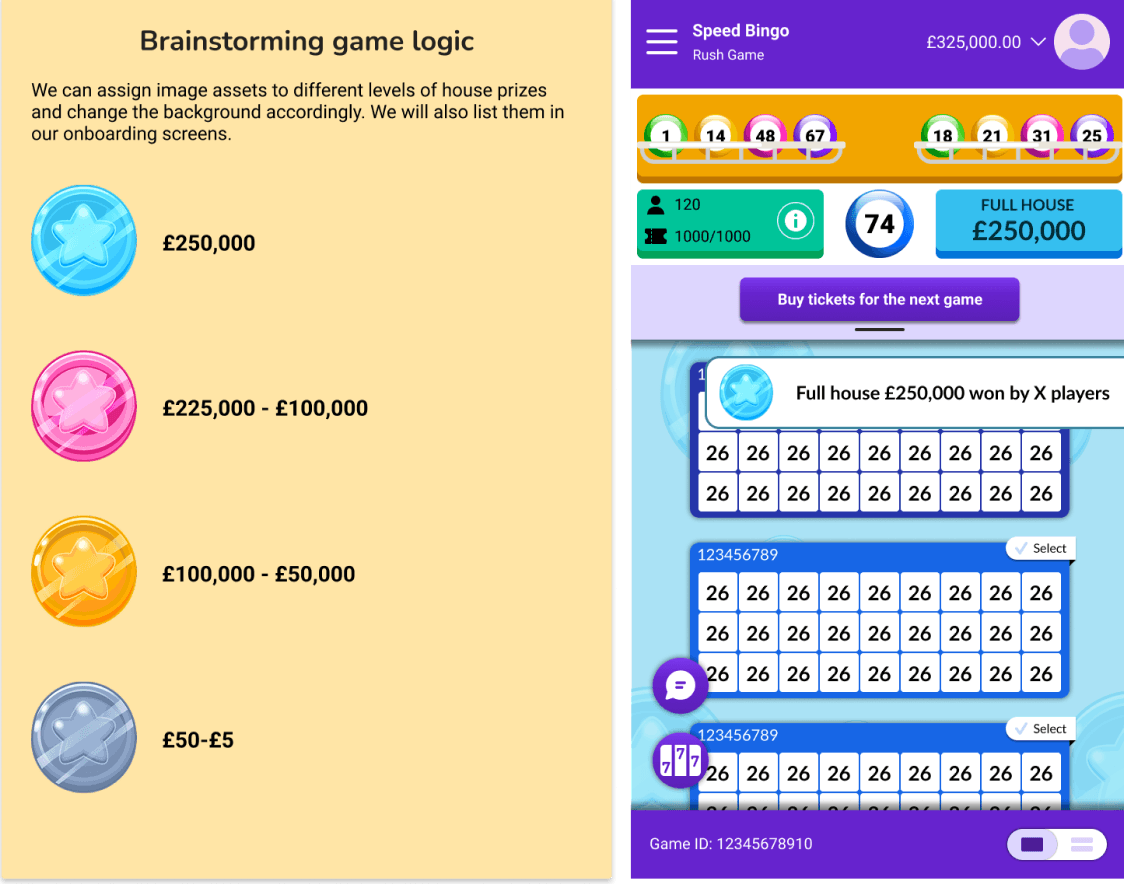
used gem imagery per prize tier with background colour shifts on each state change. Visually clear — but when a ball was called, players were processing a new image, new colour, and new number simultaneously at exactly the moment they needed to make a purchase decision. The animation competed with the information it was meant to communicate.

Rejected

Concept A

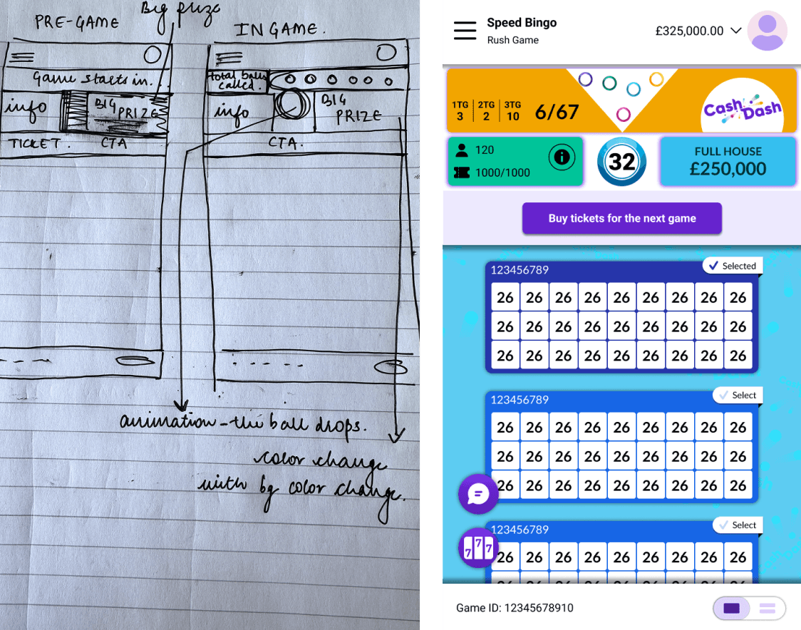
showed a single live prize value updating in real time. Clean — but a number with no context is just a number. Players could see the prize but had no frame of reference for how fast it was falling or where it was heading. Without visible trajectory, the core mechanic was invisible.

Rejected

Concept B

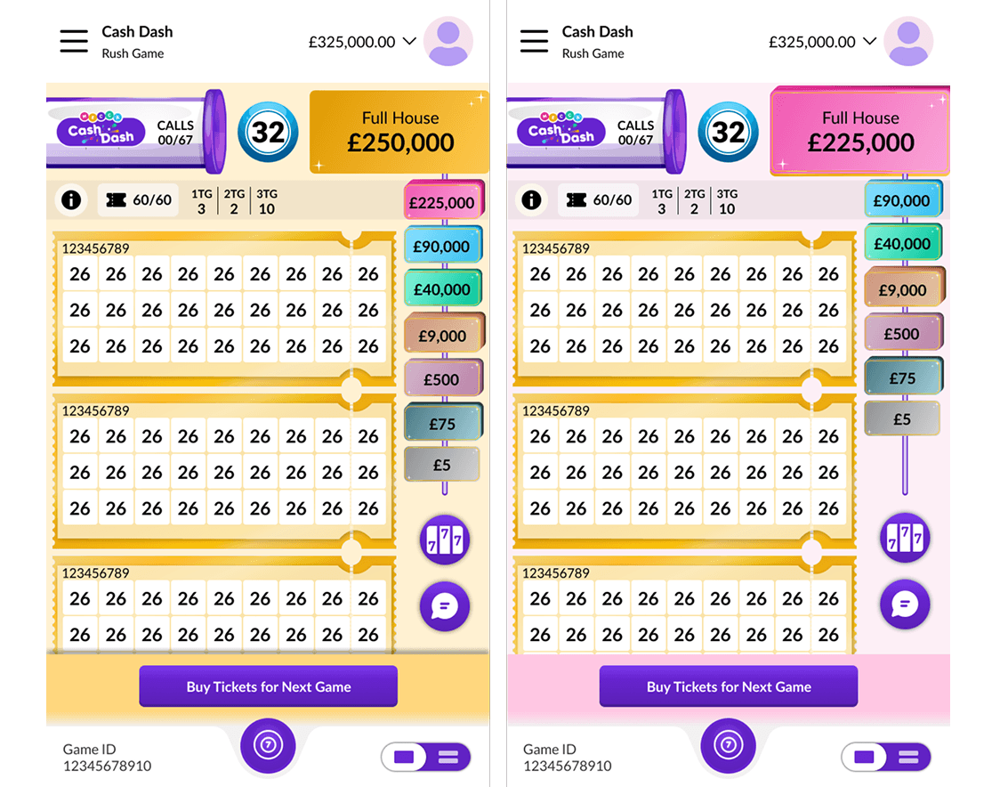
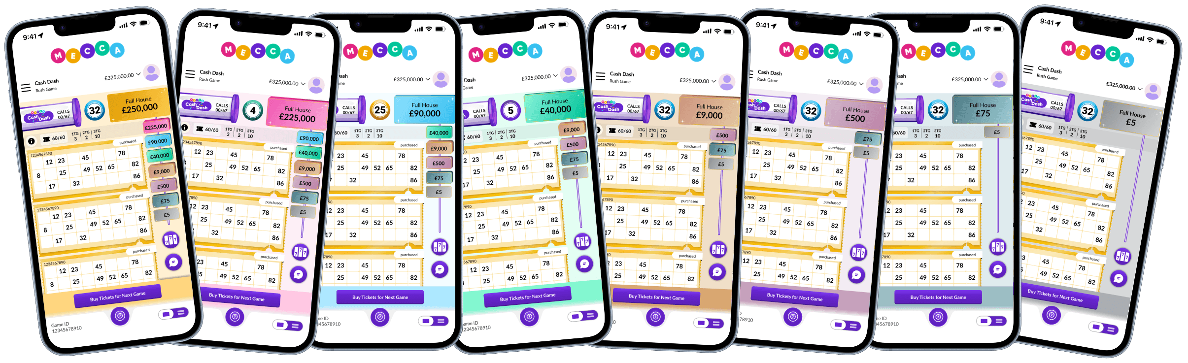
A persistent prize ladder on the right side of the screen, always visible, showing all prize levels simultaneously. When a new value tier was revealed, the top prize card slid off the right edge — revealing the next level beneath it — while the entire background shifted colour to reflect the new tier. Warm gold at the highest prizes, cooling progressively to grey at the lowest. The mechanic wasn't just visible. It was felt.

Selected

Concept C

Concept A

Used distinct imagery per price tier with background colour shifts on each state change. Visually clear — but when a new value was revealed, users were processing a new image, new colour, and new number simultaneously at exactly the moment they needed to make a decision. The animation competed with the information it was meant to communicate.

Used distinct imagery per price tier with background colour shifts on each state change. Visually clear — but when a new value was revealed, users were processing a new image, new colour, and new number simultaneously at exactly the moment they needed to make a decision. The animation competed with the information it was meant to communicate.

Rejected

Concept B

Showed a single live prize value updating in real time. Clean — but a number with no context is just a number. Users could see the current prize but had no frame of reference for how fast it was falling or where it was heading. Without visible trajectory, the core value mechanic was invisible.

Rejected

Concept C

A persistent prize ladder on the right side of the screen, always visible, showing all prize levels simultaneously. When a new value tier was revealed, the top prize card slid off the right edge — revealing the next level beneath it — while the entire background shifted colour to reflect the new tier. Warm gold at the highest prizes, cooling progressively to grey at the lowest. The mechanic wasn't just visible. It was felt.

Selected

The Decisions

Four calls. Each one pushed back on. Each one shipped.
Ticket format.

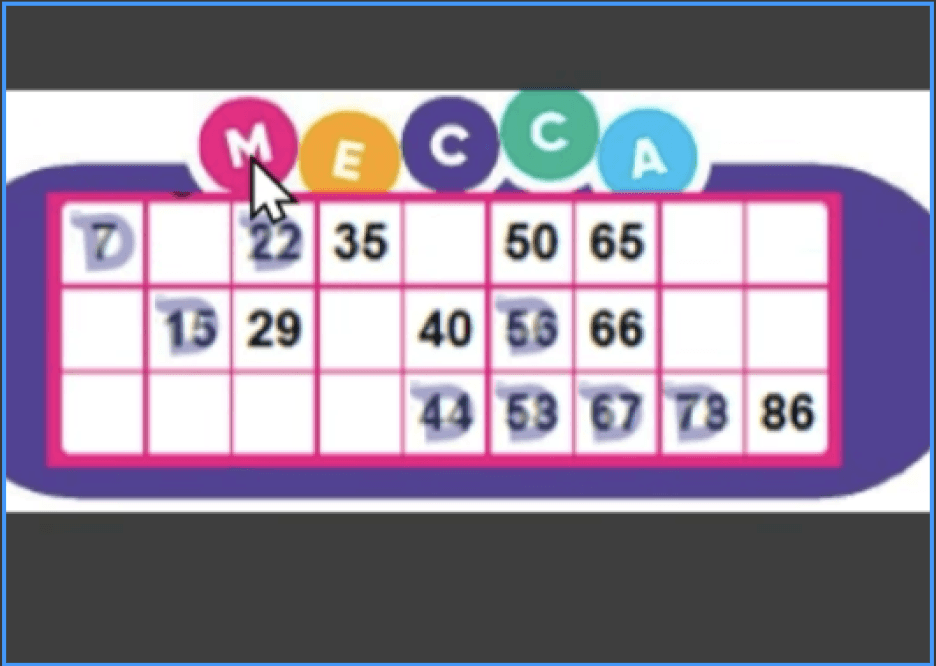
Stakeholders pushed to use Mecca's standard bingo ticket. I pushed back. The standard format consumed significantly more vertical space — reducing the number of tickets visible on screen at once, which for players holding up to 60 tickets was a functional problem, not an aesthetic one. A compact ticket also let tier colour carry the identity rather than competing with it. We shipped the new format.

Weather app image

scale differs from actual device

Weather app image

scale differs from actual device

Weather app image

scale differs from actual device

Weather app image

scale differs from actual device

Ticket format.

Stakeholders pushed to use the standard product template. I pushed back. The standard format consumed significantly more vertical space — reducing the number of items visible on screen at once, which for users managing up to 60 tickets was a functional problem, not an aesthetic one. A compact format also let tier colour carry the visual identity rather than competing with it. We shipped the new format.

Background colour shift & ladder position.

Weather app image

Engineering didn't want to build the background tier system — updating a number was simpler than shifting the environment. I argued that a number changing communicates information; a background shift communicates consequence. Users shouldn't need to check the ladder to know the value had dropped — the environment should tell them. We kept it.

Engineering had placed the floating action buttons on the left. I needed them moved to the right, directly below the prize ladder. One move, three problems solved: buttons no longer overlapped the content grid, the ladder had a natural anchor point, and prize cards could now animate off the right edge as each tier changed — following natural reading direction, making the value feel like it was moving away from you. Moving the buttons was non-trivial. We did it anyway.

A known compromise we shipped.

There was no elegant mobile solution for showing the full prize ladder within the floating button constraint. The stacking approach was functional — the full table one tap away — but the default state showed less context than the desktop version, where the full ladder sits permanently visible. I'd revisit this constraint with engineering earlier next time.

Weather app image

scale differs from actual device

Toast notifications after ball 47

Weather app image

Win probability increases significantly in the second half of a session. A full-screen win state works in a single-user context. In a multi-user session where wins are clustering in the final stretch, it would repeatedly interrupt everyone who hadn't won yet — at exactly the moment engagement is highest. Toast format gives each winner their moment without stopping the session. Other users stay engaged. When multiple users win simultaneously, each sees their own notification without the experiences colliding.

Ticket format.

Stakeholders pushed to use the standard product template. I pushed back. The standard format consumed significantly more vertical space — reducing the number of items visible on screen at once, which for users managing up to 60 tickets was a functional problem, not an aesthetic one. A compact format also let tier colour carry the visual identity rather than competing with it. We shipped the new format.

Weather app image

scale differs from actual device

Weather app image

scale differs from actual device

Background colour shift & ladder position.

Engineering didn't want to build the background tier system — updating a number was simpler than shifting the environment. I argued that a number changing communicates information; a background shift communicates consequence. Users shouldn't need to check the ladder to know the value had dropped — the environment should tell them. We kept it.

Engineering had placed the floating action buttons on the left. I needed them moved to the right, directly below the prize ladder. One move, three problems solved: buttons no longer overlapped the content grid, the ladder had a natural anchor point, and prize cards could now animate off the right edge as each tier changed — following natural reading direction, making the value feel like it was moving away from you. Moving the buttons was non-trivial. We did it anyway.

Weather app image

A known compromise we shipped.

There was no elegant mobile solution for showing the full prize ladder within the floating button constraint. The stacking approach was functional — the full table one tap away — but the default state showed less context than the desktop version, where the full ladder sits permanently visible. I'd revisit this constraint with engineering earlier next time.

Weather app image

scale differs from actual device

Toast notifications after the midpoint of the session.

Win probability increases significantly in the second half of a session. A full-screen win state works in a single-user context. In a multi-user session where wins are clustering in the final stretch, it would repeatedly interrupt everyone who hadn't won yet — at exactly the moment engagement is highest. Toast format gives each winner their moment without stopping the session. Other users stay engaged. When multiple users win simultaneously, each sees their own notification without the experiences colliding.

Win probability increases significantly in the second half of a session. A full-screen win state works in a single-user context. In a multi-user session where wins are clustering in the final stretch, it would repeatedly interrupt everyone who hadn't won yet — at exactly the moment engagement is highest. Toast format gives each winner their moment without stopping the session. Other users stay engaged. When multiple users win simultaneously, each sees their own notification without the experiences colliding.

Weather app image

Responsive

Mobile and desktop required different solutions to the same problem.

The responsive challenge wasn't layout — it was information architecture. On mobile, the floating button constraint meant the full prize ladder couldn't sit permanently in view. The solution: stack it behind a single tap, always one interaction away. On desktop, the constraint disappears. The ladder sits permanently on the right edge, always visible, no tap required. The core hierarchy is identical. What changes is how much of it is visible by default — and that decision was made per-platform based on available space, not adapted from a single master layout.

Desktop also changed the impact of the background tier colour shift. At full screen width, the environment change registers peripherally — users feel the tier drop before they consciously notice it. On mobile that ambient effect is reduced by screen size. The same signal, different sensory weight.

Validation

Moderated usability test · 20 participants · 2025

One question drove the entire test: could users understand the stake/prize relationship without being told?

We tested with 20 participants across three groups: regular users, occasional users, and people with no prior knowledge of the product. The inclusion of genuinely unfamiliar users — not just internal staff — was deliberate. Comprehension that only holds for insiders isn't comprehension.

94%

understood the full prize progression after a single session

92%

correctly identified the stake/prize relationship without prompting

100%

completed a full session — zero drop-off

Results

35% of all purchases at launch were at the two highest price points — from day one. No benchmark to compare against, but the direction confirmed the design was working.

Visible trajectory over live state.

Visible trajectory over live state.

Showing where the prize was heading — not just where it was — was the decision that made the mechanic comprehensible. Any interface involving a changing value benefits from showing the direction of change, not just the current state.

Showing where the prize was heading — not just where it was — was the decision that made the mechanic comprehensible. This is a principle that applies well beyond gaming: any interface involving a changing value benefits from showing the direction of change, not just the current state.

Showing where the prize was heading — not just where it was — was the decision that made the mechanic comprehensible. Any interface involving a changing value benefits from showing the direction of change, not just the current state.

Environment as status indicator.

Environment as status indicator.

The background tier system communicated product state passively, at screen scale, without requiring attention. The colour did narrative work no label could.

The background tier system communicated game state passively, at screen scale, without requiring attention. The colour did narrative work no label could.

Prize before price.

Showing the maximum prize ceiling before the stake cost in the purchase flow reframed the decision from risk to ambition. Users chose their level of upside first, then confirmed the cost

Showing the max prize ceiling before the stake cost in the purchase flow reframed the decision from risk to ambition. Players chose their level of upside first, then confirmed the cost.

Reflections

What I'd do differently process-wise.

The two biggest revision cycles — floating button repositioning and the background tier system — both emerged as engineering constraints at handoff rather than during ideation. One collaborative session in week one would have caught both. Design–engineering alignment isn't a handoff problem. It's a process problem.

What we learned from players post-launch

One consistent piece of feedback that came through after launch: players wanted the ticket quantity slider removed. The slider — intended to make quantity selection feel fluid — added a step that felt unnecessary to players who knew exactly how many tickets they wanted. We logged this as a confirmed priority for the next release. It's a good reminder that interaction patterns that feel intuitive in design don't always survive contact with real usage at scale.

What I'd build next.

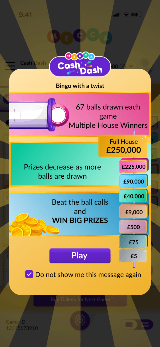
The tutorial screen worked for first-time players — but it got skipped by anyone who assumed they already understood the game. You can see why: it's a static overlay that asks for attention before the game has given players any reason to be invested.

Next iteration: contextual pop-ups woven into the first round itself, appearing at the exact moment each mechanic first becomes relevant. The prize ladder appears — a tooltip explains it. The first ball is called and the prize drops — a prompt highlights what just happened. Four or five moments of contextual explanation, zero gap between learning and playing.

Weather app image

What I'd do differently process-wise.

The two biggest revision cycles — floating button repositioning and the background tier system — both emerged as engineering constraints at handoff rather than during ideation. One collaborative session in week one would have caught both. Design–engineering alignment isn't a handoff problem. It's a process problem.

The two biggest revision cycles — floating button repositioning and the background tier system — both emerged as engineering constraints at handoff rather than during ideation. One collaborative session in week one would have caught both. Design–engineering alignment isn't a handoff problem. It's a process problem.

What I'd build next.

The onboarding screen worked for first-time users — but it got skipped by anyone who assumed they already understood the product. You can see why: it's a static overlay that asks for attention before the product has given users any reason to be invested.

Next iteration: contextual prompts woven into the first session itself, appearing at the exact moment each mechanic first becomes relevant. The prize ladder appears — a tooltip explains it. The first value drops — a prompt highlights what just happened. Four or five moments of contextual explanation, zero gap between learning and using.

The onboarding screen worked for first-time users — but it got skipped by anyone who assumed they already understood the product. You can see why: it's a static overlay that asks for attention before the product has given users any reason to be invested.

Next iteration: contextual prompts woven into the first session itself, appearing at the exact moment each mechanic first becomes relevant. The prize ladder appears — a tooltip explains it. The first value drops — a prompt highlights what just happened. Four or five moments of contextual explanation, zero gap between learning and using.

Weather app image

V1 onboarding — functional, skippable, and a clear signal for what V2 should fix

This project changed how I think about designing any interface where a value changes in real time — financial dashboards, live pricing surfaces, real-time data products. The principle holds: show trajectory, not just state.

Get in touch

jain.tanisha23@gmail.com

All rights reserved, ©2026

Get in touch

jain.tanisha23@gmail.com

All rights reserved, ©2026

Get in touch

jain.tanisha23@gmail.com

All rights reserved, ©2026